
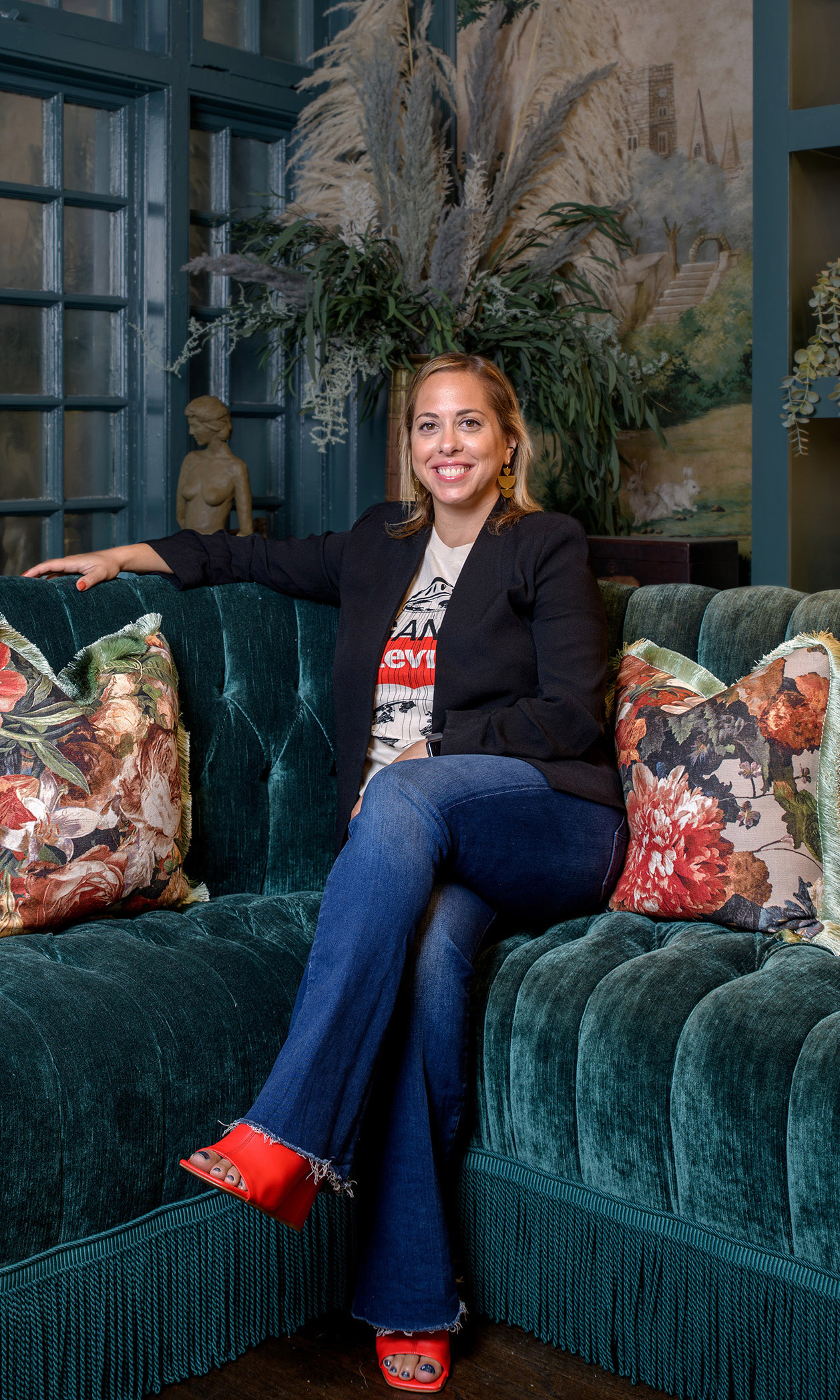
If you’ve ever been to the Guild House Hotel, the Philadelphia boutique hotel, or popped by the website, or even just passed the historic, stately building at 13th and Locust, then you’ve seen the beautiful work of Corey Pontz and her team at CWP Design. Corey, a graphic designer and founding creative principal of CWP, has worked with companies and organizations all over North America in branding and design projects, and it was her talented team who created and designed the Guild House logo, the hand-drawn icon and the signage … as well as the custom-made history books you can find in each room, the guest directories, the brochures, the website, and more.
When she and her team heard about the concept for Guild House Hotel, Corey says, it felt like a natural fit. First, the project fell into her creative sweet spot: CWP has worked with both boutique hotels in Philadelphia (they branded the Chestnut Hill Hotel, for example) and historic brands (they also worked with the American Academy of Political and Social Science, founded in 1889). “We were jazzed about how we could craftily merge the old with the new” in a historic Philadelphia hotel.
Secondly, she says, there was the team itself: “Everyone involved was so passionate about the project—the developers, the interior designers, the copywriters, photographers. We felt that energy and wanted to be a part of it.”
Here, Corey talks about finding inspiration in history, working through a pandemic, and the woman-centric Guild House ethos that made this job so unique.
First things first: Are you a born-and-bred Philly girl, or a transplant?
I grew up in Radnor. I’ve been in the Philly area most of my life. I went to college in upstate New York, but then came back to the area post-college. If you live in the Philly area, you know how special it is. It was never a thought to live elsewhere as an adult.
And how long have you been in the graphic design game?
CWP Design Studio opened its doors at the end of 2008. However, I had been working as a graphic designer/web designer since college. If you go back even further, I have been designing since I was probably about 9 years old, when I learned to photoshop my head on celebrities’ bodies.
What drew you into the Guild House Hotel project?
Not only was the team and their passion a draw, but all the major players and stakeholders in constructing the brand and space are female. It was exciting to think about the amazing women of history who paved the way to make it possible for the women of our time to be the decision makers and creators of such a project.
Let’s talk about the scope of your work at Guild House. What, exactly, did you conceive and create for this project, and what were the considerations?
We created the logo—both the Guild House Hotel full logo and the hand-drawn GH icon. We provided design direction for the signage as well—it was important to convey a consistent look and feel in order to align with the overall brand. The devil is in the details, so everything down to the bath labels, brochures, custom-made history books, and evacuation maps was created with a specific aesthetic in mind. The goal was to keep the work elegant and minimal, with a nod to the landmark’s history.
From a digital perspective, in addition to designing the website, we also created the social media graphics and invitations for the soft opening and grand opening. It’s essential that today’s brands have a quality online presence—one that’s cohesive and aesthetically pleasing in order to amplify the brand identity. Working with a historical brand in the digital space is an interesting challenge. However, it also creates opportunity: Giving style and personality to online elements helps to add dimension to a space that often feels flat.
About that logo: What were you trying to evoke? What inspired you as you worked on this boutique hotel project?
I knew fairly quickly what I wanted the logo to look like. Our team worked together to turn that idea into a few options that we tweaked and fine-tuned with the larger group until we came up with the final version. We referred back to the original materials from the New Century Guild in the early 19th century, and we found a font that complimented that tone.
The font we used—it’s called Bellwether Antique NF—is described as “a quaint charmer based on the original, 1913 antique version of Georg Belwe’s eponymous classic.” So it’s basically a modern spin on an early 1900s font. It represented our first opportunity to perfectly merge the old and the new for this project.
What was your process like as you dove into this project, your inspiration?
Brennan Tomasetti, one of the co-founding owners of Guild House Hotel, gave us a plethora of old-time documents, photos, and historical references. We toured the building, and worked with brand strategists who created a competitive audit to better understand the landscape of the local hotel scene. We also got a really good read on what the hotel would be with the clear vision provided by the interior design team, Rohe Creative.
What was the biggest challenge with this project?
Covid. It put a huge delay on the project, and there was a lot of uncertainty. The opening date was pushed back, which was a bummer for all involved. Having the hotel open now is even more exciting because of how long we’ve been waiting for the public to have the chance to appreciate this special hotel experience.
What’s been your favorite part of this historic hotel project?
We worked on creating a “scrapbook” that details each of the different women who served as inspiration for the rooms. Between the women’s stories, the beautifully written content and the room inspiration, we had a really fun time crafting this book to—again!— feel like old-meets-new. The end result really came together in a way that even exceeded our own expectations.
Favorite detail in the hotel?
When you walk into the hotel, the first thing you see as you enter is the hand-drawn “GH” icon that we created, inlaid within the tile flooring. It really makes an impact that sets you up for all the special details that you’re about to take in.
Did anything surprise you over the course of the project?
I can’t say that anything particularly surprised me. However, when you have so many competent people coming together to collaborate on a project, magic can happen. Seeing our logos converted into a stunning brass sign with gold leaf lettering, or the crushed velvet pillows with the logo embroidered, just makes you want to swoon. And the finished product of the whole thing: The spaces feel quaint and personal, almost like you’re getting a glimpse of the lives of these remarkable women of the New Century Guild for the duration of your stay.